
Life is stressful, picking up takeout shouldn’t be
An app designed to help ease the stress and headaches associated with picking up a meal
FoodFillment
OVERVIEW
Even though ordering meals online and through apps isn’t anything new, users are still too often experiencing trouble; not with the ordering process, but with the fulfillment. The order pick-up process is confusing, chaotic, frustrating, and commonly unsuccessful.
PROBLEM
Research found users had very little challenge or negative feedback with the apps they were currently using to order take-out food. The challenge, or pain-point, was experienced during pick-up. Multiple interviewees expressed dissatisfaction and frustration with their experiences picking up their orders, describing the process as chaotic, confusing, and frequently lead to the all-to-common order mix-ups.
GOAL
Bring communication and support to help minimize the confusion experienced between ordering a meal and getting the meal you ordered.
SOLUTION
An order fulfillment app concept providing real-time progress and communication from payment through pick-up.
Role:
UX Researcher
UI Designer
Tools:
Axure
Sketch
Paper and Pen
Methods:
Directed Storytelling Interview
User Flow
Usability Testing
Think-Aloud Protocol
Timeline:
1 week sprint
THE PROCESS
1. DISCOVERY AND RESEARCH
DIRECTED STORYTELLING INTERVIEWS
Conducted directed storytelling interviews in order to understand pain points and opportunity areas. A sample size of 3 adults were asked to tell a story about a time when they ordered food or groceries for pickup.
Research findings were synthesized to uncover key insights to determine a goal statement:
”Households wishing to enlist a simplistic food procurement system
that’s trustworthy and reliable from order THROUGH fulfillment,
thus alleviating the stress and time associated with picking up a meal.
2. DESIGN
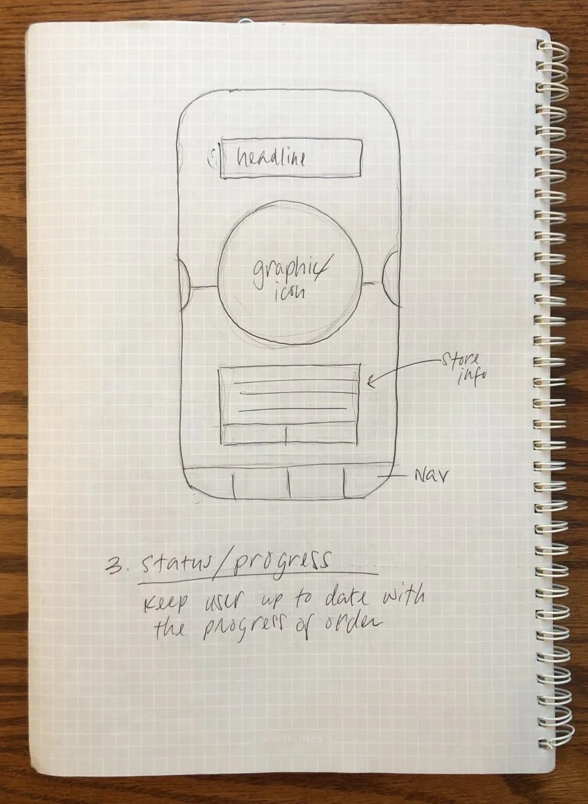
INTITIAL SKETCHES
Based on the information architecture I created hand drawn sketches of select key screens to begin development of the app’s look and feel and functionality.
MID-FIDELITY WIREFRAMES
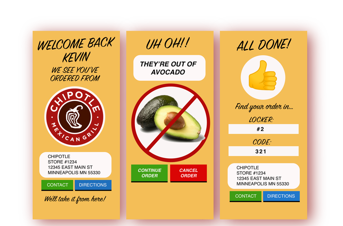
Happy with the lo-fi wireframes I created a medium-fidelity prototype, clarifying design and layout, to help provide key interactions and testable functionality when it will be placed in the hands of users in the next step.
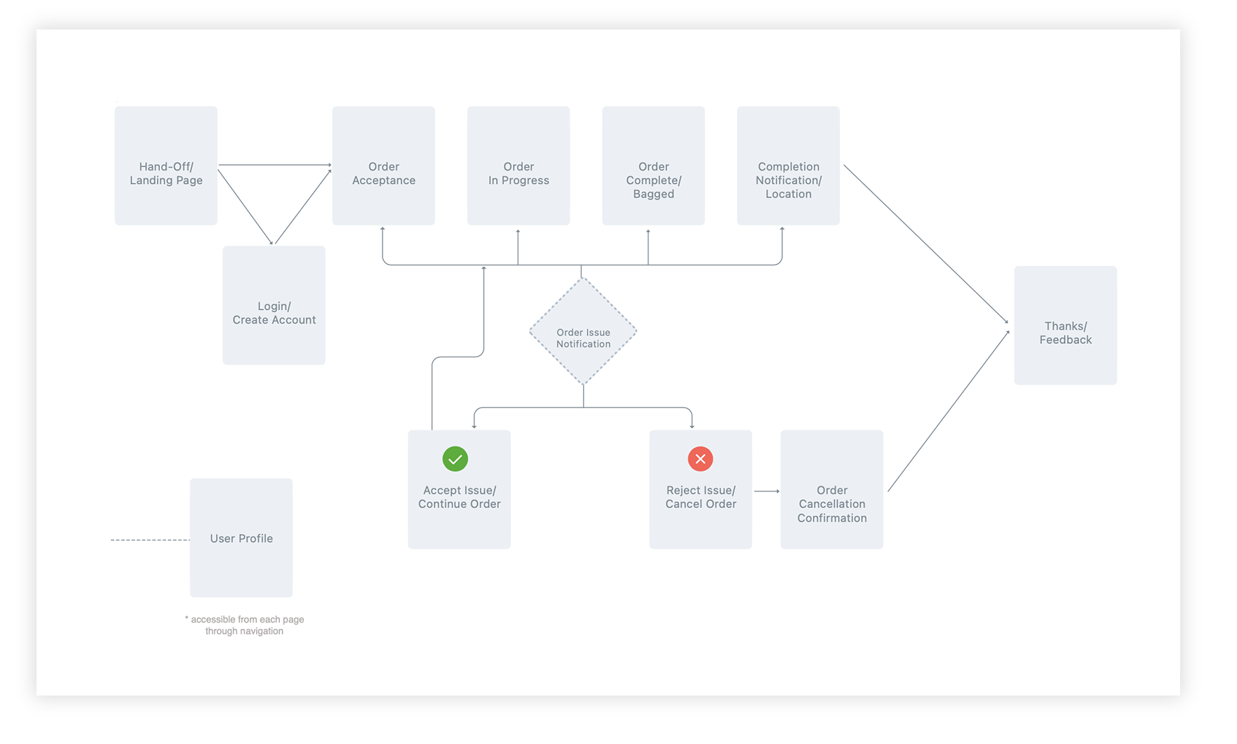
INFORMATION ARCHITECTURE
First, an information architecture diagram was created to provide a decision map from a user’s exploration of the application.

Original Information Architecture Sketch
Information Architecture
LOW-FIDELITY WIREFRAMES
Next was development of low- fidelity mock-up based on the sketches but focusing on the functionality and information layout of the screens.


Sketch 01: Welcome/Landing Page
Sketch 02: Notification/Call to Action
Sketch 03: Status/Progress
Sketch 04: Completion


3. USER TESTING
GOALS:
Evaluate users ability to navigate the app in order to gain insights to potential pain-points and confusions and to help uncover opportunities to provide a better user experience.
Evaluate if the concept actually provides a solution to current gap in the fulfillment process.
OBJECTIVES:
can users successfully monitor an order through to completion?
Can users perform specific tasks within the app?
How would users describe this app?
Do users feel app successfully solves the current challenge?
METHODOLOGY
A script was crafted focusing on key tasks for users to complete during a think-aloud interview session utilizing the mid-fidelity mock-up.
- Usability research was conducted in-person with 3 participants
- All participants had experience using a mobile app to order take-out food
- Participants received minimal explanation of the app; ex; “food order tracking app”
- Participants were asked to talk aloud, providing thoughts and feelings while using app
- The same set of questions and tasks were used for each participant

4. CONCLUSION
Overall, users found the app to be easy, user friendly, and believed it to be a good solution.
Based on feedback, there are minor modifications needed for clarity, but overall users were pleased.
Next Steps
Usability testing revealed a few recommendations to consider in order to improve functionality and user understanding. Examples include:
simplification of graphics and pages
copy that doesn’t alarm the user and better articulates user steps
adding explanations or store policies when requesting an alteration of order
Due to confusion of the location and size of certain represented icons, I would like to conduct further usability testing with a high-fidelity mockup to compare feedback